Nervous System
The Unmeasured Cost: How Modern UI/UX Hijacks Your Nervous System
We explore the collision between modern UI/UX design and the human nervous system, arguing for interfaces that prioritise our regulation over engagement.
The Unmeasured Cost: How Modern UI/UX Hijacks Your Nervous System
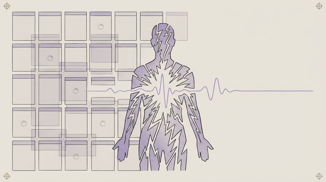
The trouble with your phone isn’t that you lack willpower; it’s that the app designer has a better grasp of your nervous system than you do. We’ve collectively decided that being perpetually distracted and vaguely anxious is a personal failing, a character flaw to be fixed with a digital detox or a mindfulness app. The truth is less poetic: the exhaustion you feel is the predictable, biological cost of a user interface (UI/UX) designed to hijack your body’s core survival machinery for profit. It’s an architectural problem, not a moral one.
Common Questions
What does UI/UX have to do with my nervous system?
Modern user interface and user experience design is engineered to trigger specific neurochemical responses. The red notification badge, the "pull-to-refresh" mechanism, the infinite scroll — these aren't random choices. They are deliberate designs that target your brain's reward (dopamine) and stress (cortisol) pathways to keep you hooked.
Is "digital addiction" a real thing?
The label is less interesting than the mechanism. The compulsive checking, the phantom vibrations, the low-grade anxiety when you're disconnected — these are symptoms of a system that has successfully latched onto your orienting response and reward circuitry. The techniques used are borrowed directly from the playbook of the gambling industry, which has been an expert in hijacking human neurology for centuries.
Can a digital detox fix this?
Temporarily, but it doesn't solve the underlying problem. A detox is like fleeing a house with faulty wiring instead of hiring an electrician. The moment you return, the same structural flaws will produce the same outcome. The sustainable solution is to renovate your digital environment and reinforce your own internal nervous system regulation so the outside world has less of a grip.
The Slot Machine in Your Pocket
The wellness industry has somehow managed to rebrand "breathing"—a thing you do involuntarily—into a paid course, while simultaneously ignoring the single biggest unregulated tax on our attention. I’m talking about the variable reward schedule. It’s the engine of every slot machine in Vegas and every social media feed in your phone.
You pull the lever (or your thumb down the screen) and you might get a reward: a juicy email, a "like" on your photo, a surprising piece of news. Because the reward is unpredictable, your brain’s reward system goes into overdrive. This is the mesolimbic pathway at work, the circuit that releases the neurotransmitter dopamine in anticipation of a potential prize. It's not the reward itself that hooks you, but the possibility of it. Infinite scroll and pull-to-refresh aren't features for your convenience; they are finely tuned instruments for inducing a state of seeking, turning your phone into a pocket-sized casino where the currency is your focus.
Your Phone Wants Your Adrenal Glands
That tiny red circle with a number in it isn't a friendly reminder. It's a targeted neurological weapon. Red is the color of emergency, of stop signs, of blood. It’s a color your brain is hardwired to notice and interpret as urgent. This is by design. The notification badge, the banner that drops down, the ding that cuts through a conversation—they are all engineered to hijack your orienting response.
This is your brain’s automatic, pre-conscious reflex to anything new or unexpected in your environment. It’s a survival mechanism that tells you to stop what you're doing and pay attention right now. Each notification is a manufactured micro-crisis, a tiny, unnecessary activation of your HPA axis (the hypothalamic-pituitary-adrenal axis, your body's central stress response system). A single one is trivial. But hundreds a day? That’s not a communication strategy. That’s how you generate chronic, low-grade physiological stress and burn through your adaptive capacity.
The Locus Coeruleus and the Cost of Novelty
Let’s get properly nerdy for a moment. Deep in your brainstem sits a tiny, bluish-colored cluster of neurons called the locus coeruleus (LC). You can think of it as your brain’s novelty detector and system-wide alarm bell. When something unexpected happens—a sound, a flash of light, a notification—the LC fires, releasing norepinephrine (noradrenaline) across your brain. This is what sharpens your focus, heightens your arousal, and yanks you out of whatever you were doing. It’s the circuit that says, “Pay attention to this instead of that.”
Modern UI/UX is a relentless, low-grade assault on the locus coeruleus. Every badge, buzz, and banner is another poke, another prod, another manufactured signal of novelty. Over the course of a day, this keeps the LC in a state of hyper-vigilance, constantly scanning for the next interruption. This sustained activation is a significant contributor to allostatic load—the cumulative wear and tear on your body from chronic stress. You feel "wired and tired" because, architecturally, you are. Your brainstem is being played like a fiddle by a system that profits from its distraction. For a deeper dive on what's going on under the hood, we cover the LC and other deep-brain structures inside the Kokorology Library.
The goal of most modern user interfaces isn't to solve your problem; it's to become your problem.
Designing for Regulation, Not Engagement
The conversation around "mindful tech" often puts the onus back on you. Meditate more. Be more present. Try harder. This is a convenient misdirection that absolves the designers of any responsibility. You cannot meditate your way out of a system that is structurally designed to dismantle your focus. It’s like trying to mop the floor while the sink is still overflowing.
The real solution is architectural. It involves making deliberate, structural changes to your digital environment to reduce the neurological load. This isn’t about self-flagellation; it’s about strategic renovation. The aim is to create an environment that supports your nervous system, rather than one that constantly exploits it. This might mean making your phone less interesting, adding friction to compulsive behaviors, and reclaiming the boundaries between you and the attention economy. It's not a "detox," it's a permanent rewiring. A few simple moves in the Kokorology Hacks library are designed for exactly this.
What to do this week
- Turn your phone to grayscale. Go into your accessibility settings and drain the color. This single move dismantles the effectiveness of those urgent red notification badges and makes the whole device significantly less neurologically stimulating. The novelty machine suddenly becomes boring.
- Delete one social media app. For one week. Access it only through your phone's web browser. The user experience is clunkier and, crucially, it can't send you push notifications. This adds a layer of friction, forcing you to be intentional instead of reactive.
- Conduct a notification audit. For one day, use the Kokorology Journal to make a note every time a notification pulls your focus. Log what it was for and how it made you feel (Anxious? Irritated? Distracted?). Awareness precedes control. You can't change what you don't see.
- Establish a digital curfew. One hour before you plan to sleep, put your phone away. And not just on the nightstand—charge it in another room. Your brain needs that time to downshift, and the blue light from the screen directly interferes with melatonin production, a key hormone for initiating sleep.
Where this fits in the Kokorology system
The constant drain from our digital environment is a massive, unmeasured tax on our adaptive capacity. Reclaiming your focus isn't a bonus feature; it's foundational to every other part of your life and performance. If you feel so overwhelmed by this that you don't know where to start, the Kokorology Reset is a 7-day structured program designed to lower the noise and rebuild from the ground up.
Closing
The exhaustion you feel isn't a personal failure; it's a design success. Your nervous system is working exactly as it's been manipulated to work. The only way out is to stop blaming your willpower and start rebuilding your architecture—both the digital environment on your screen and the biological one inside your own body. Which will you renovate first?
- Start with our 7-day guided program inside the Kokorology Reset.
- Practice reclaiming your focus with the Digital Boundaries Anchor.
- Get our free guide to the 5 most common nervous system myths.
TL;DR
Your struggle with screen time is not a failure of self-control; it's the intended outcome of a sophisticated UI/UX design that hijacks your nervous system. Through mechanisms like variable reward schedules (dopamine) and urgent notifications (cortisol), modern apps create a state of chronic, low-grade stress and compulsion. Reclaiming your attention and energy requires architectural change—renovating your digital environment to reduce its neurological hooks—rather than simply trying to have more willpower. This is a structural problem that demands a structural solution.
Sources
- Adam Alter (2017). Irresistible: The Rise of Addictive Technology and the Business of Keeping Us Hooked. Penguin Press.
- Nir Eyal (2014). Hooked: How to Build Habit-Forming Products. Portfolio.
- Sara L. P. Sara (2009). The locus coeruleus and noradrenergic modulation of cognition. Nature Reviews Neuroscience.
- Tristan Harris (2016). How Technology is Hijacking Your Mind—from a Magician and Google's Design Ethicist. Thrive Global.
- David J. Linden (2011). The Compass of Pleasure: How Our Brains Make Fatty Foods, Orgasm, Exercise, Marijuana, Generosity, Vodka, Learning, and Gambling Feel So Good. Viking.